Event Browsing App: What2Do
I designed an event browsing app based on an interests profile for my Interaction Design: Mobile class.
UX Process Summary:
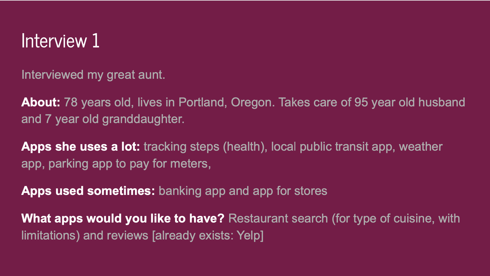
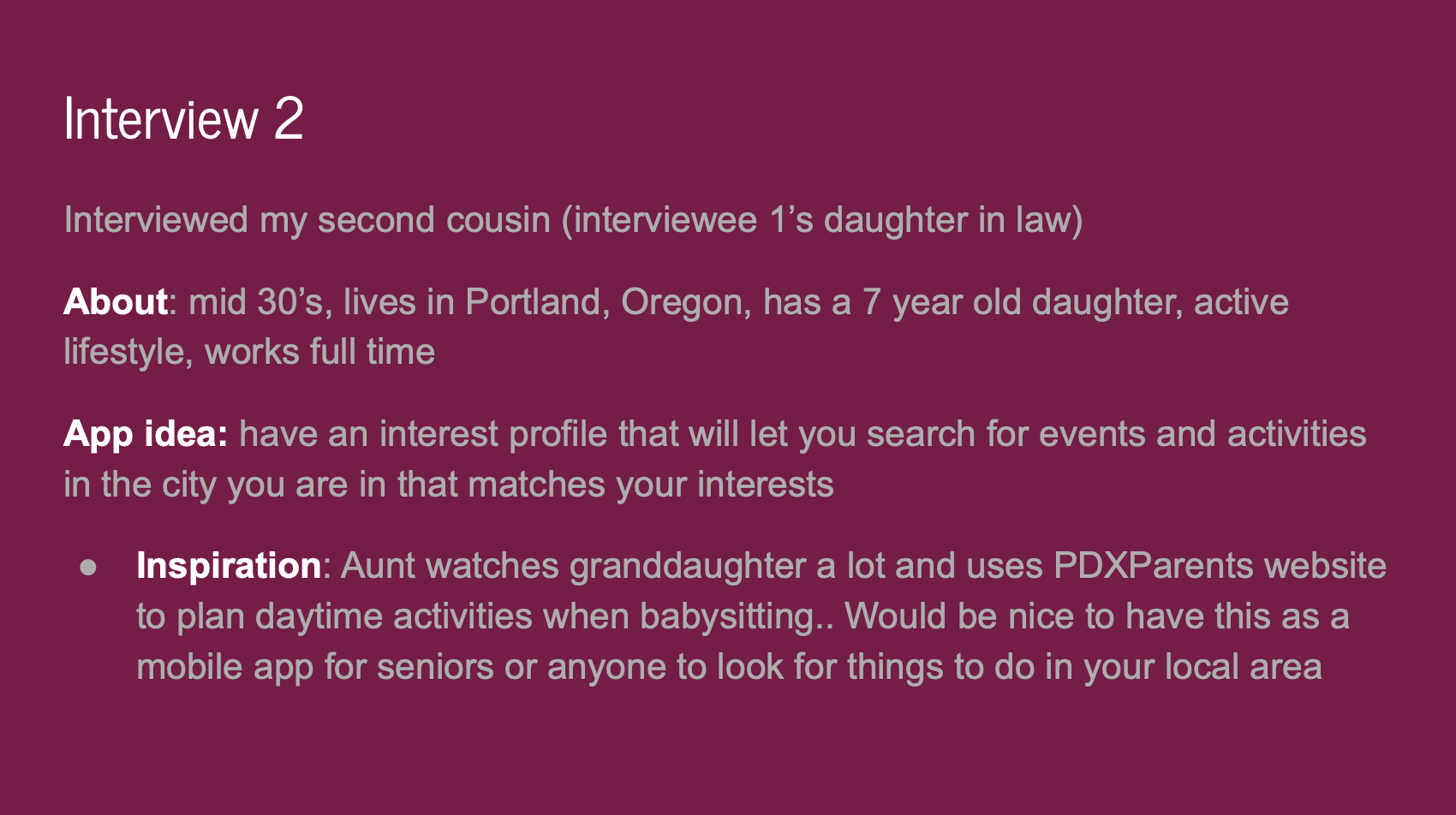
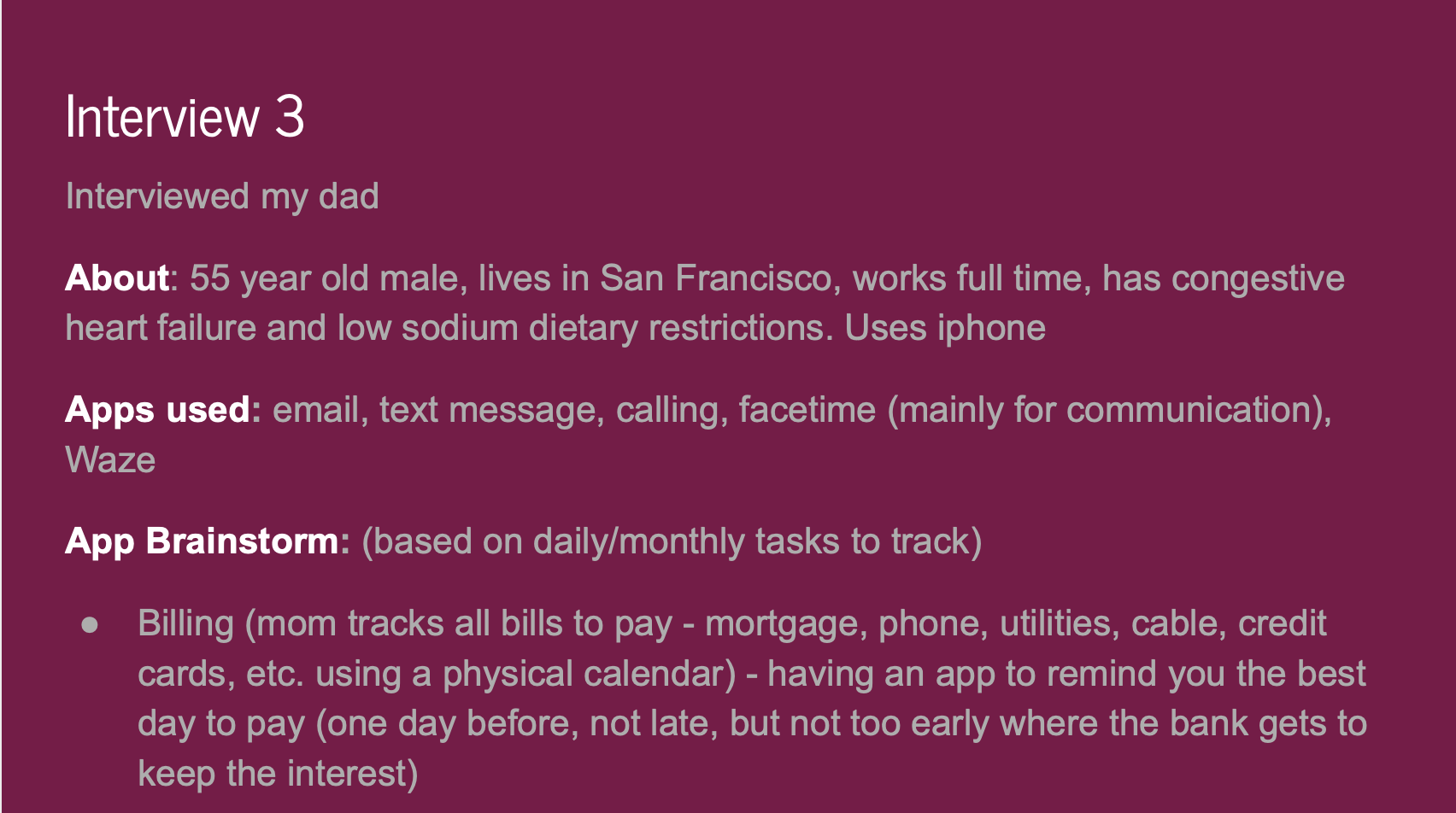
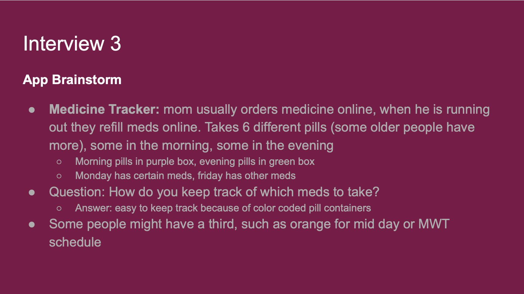
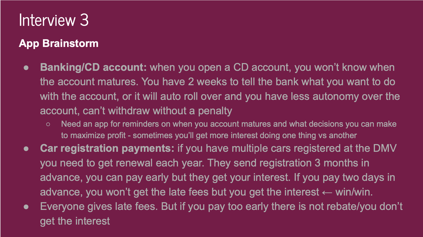
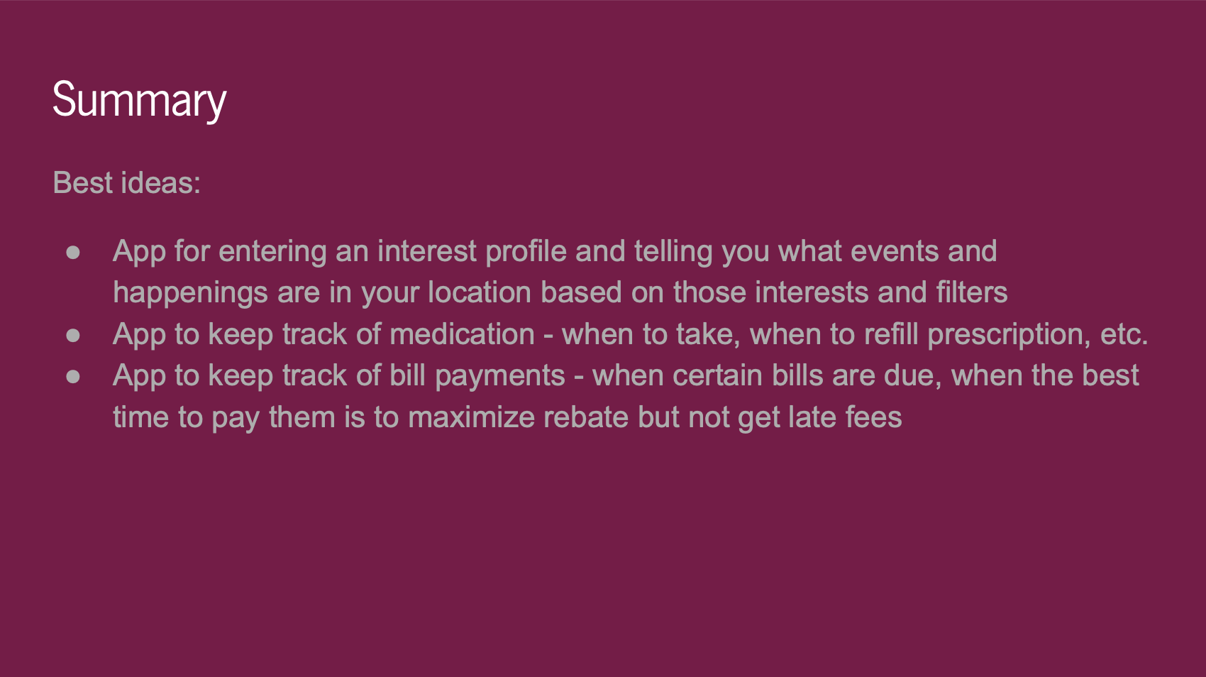
The first step in the process was to conduct user research to come up with an idea. The prompt was to focus on the elderly population, so I interviewed my greay aunt, my second cousin who lives with my great aunt, and my father, all ranging in ages 45-78 years old. Through each of these phone interviews, we discussed ideas for apps that they currently used that could use improvement, or apps they wished they had that would improve their everyday lives. The two ideas I narrowed my search down to were a pill reminder app, or an app to search for nearby events based on interests. I was leaning towards the pill reminder app, but after doing market research, I found that there were many apps that did what I was trying to do perfectly already. I decided to focus on an events app.
After conducting my initial user research, I came up with a Brand Identity, including creating a logo, choosing colors, and deciding on fonts. I later changed the font style I used, but this was a starting point. I also did market research and creating a brand audit, where I looked for other apps that had features I was looking for. There were not many apps that catered to elderly people with respect to events.
User Interviews
- I conducted interviews targeting older populations of mobile phone users
- I interviewed 3 relatives of various ages (ranging from 38-78 years old) over the phone
- I asked about current phone app usage and potential future apps they wished to have
Service Identity and Branding Guidelines
I created a service identity and branding guidelines with color choices and font choices for my app. The font choices were not final, and changed in the final prototype. I stuck with the wine color as my main app color, because this is a color I did not see on many mobile apps and wanted my app to stand out. I created a logo in Illustrator, with a calendar and question mark, and the name What2Do to capture the essence of finding events and filling a schedule.

Market Research
I conducted market research to see if there were apps that were similar to what I had in mind. I coudl only find three other apps in the Apple app store that catered towards events for elderly people. I compared their functionality and features with features that I wanted to implement in my app. The apps on the market fell short of what I wanted to include, so this was a gap in the market. (The light colored dots indicate that the app comes close to achieving the feature, but it is slightly different).

Service Concept
Creating a service concept helped to describe why someone would need to use this app to enhance their life.

Personas
Coming up with personas helped to create examples of people that would use the app, and are characters that will be used in my hero's journey and storyboard later on.


Hero's Journey
The hero's journey shows different steps in the process of using this app, from the start, where a problem is identified, to the middle, where the app is found as a solution, to the end, where the person has changed as a result of using the app. It also shows how the user might want or need different features in the app in order for them to remain a user, or keep coming back. I created this using InDesign.

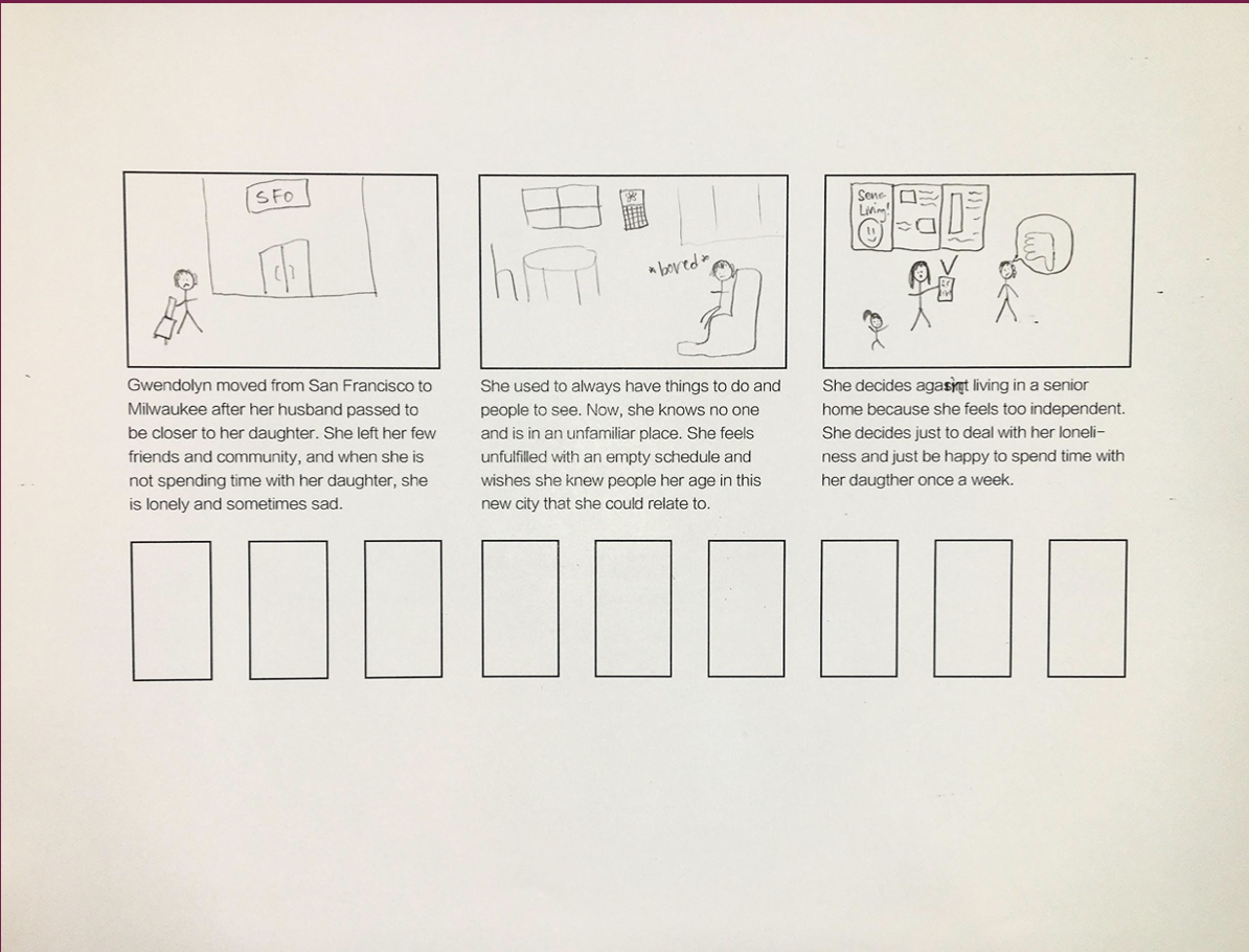
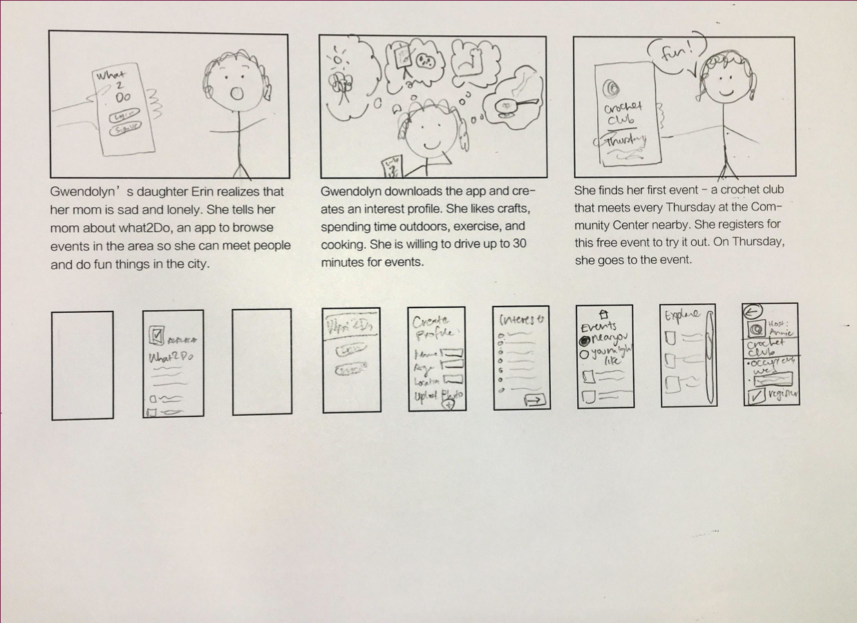
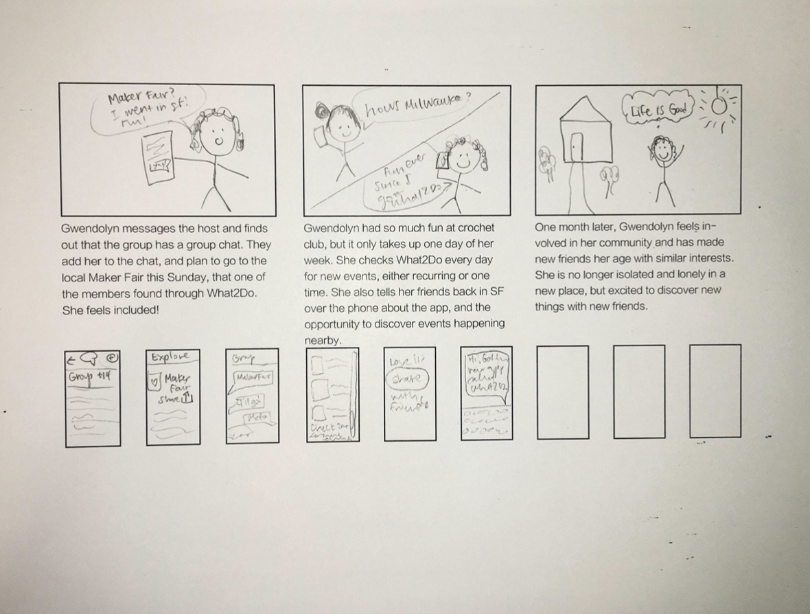
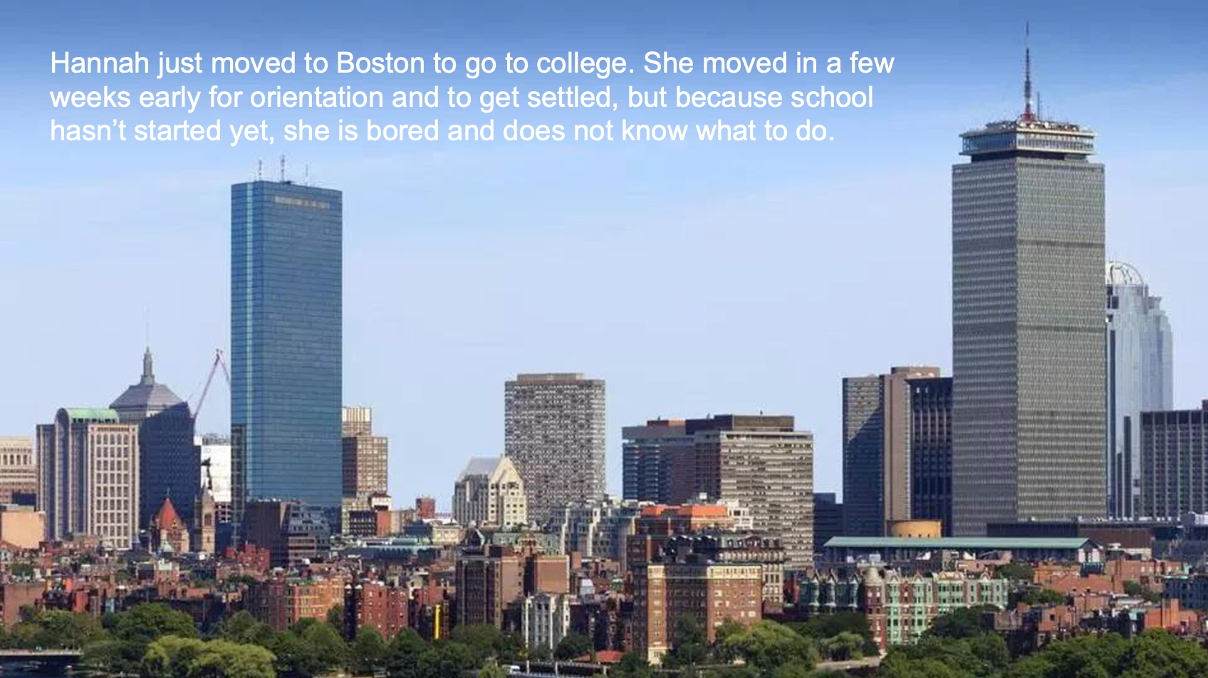
Storyboard
Storyboarding an example of my example user using the app helps identify pain points and how using the app will enahnce their life. It follows the hero's journey. There are also places below the comic that allow for some user interfacing on mobile screens. I kept these small to avoid too much detail work, to keep these ideas high level.

UI Spec
I created a UI Spec in AdobeXD for my app What2Do. Pink text indicates where to click and what information that action provides.
Login Screen

Events Page

Showing a drop down menu to sort

Showing a scrolling feed of events.

Individual Event page

User Profile page, Interest Profile tab

User Profile page, Events Tab with info

VD Spec
The VD Spec shows fonts, colors, and sizes to be used within the app. It follows the service identity and branding guidelines from above. Some changes were made, such as the font type. Also, later on, based on feedback, I changed the active button to be colored burgandy to further enhance it, as opposed to dark gray.

Here I have implemented the colors and fonts from my VD Spec into my prototype.

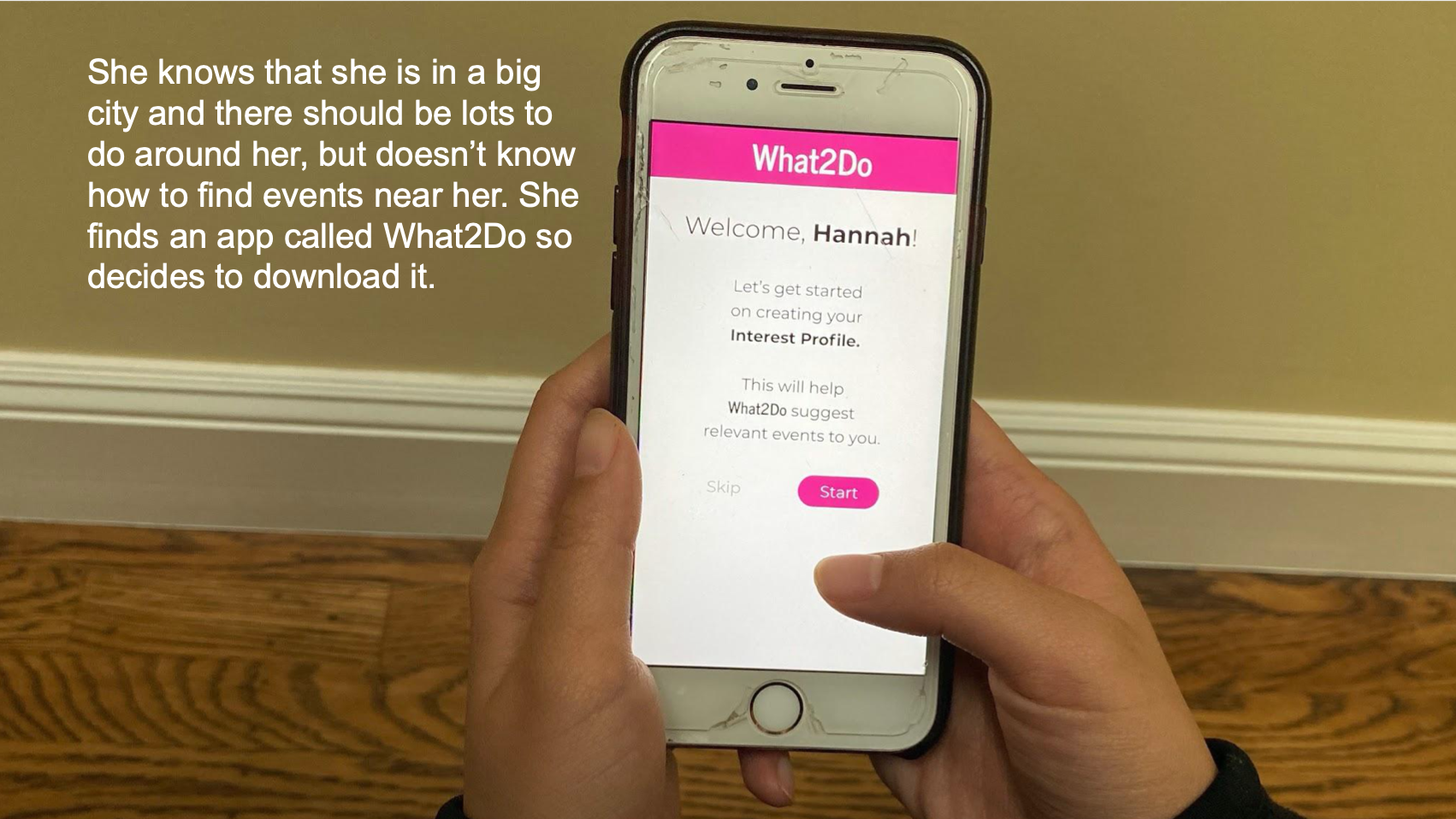
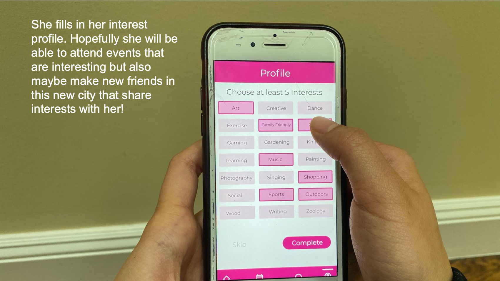
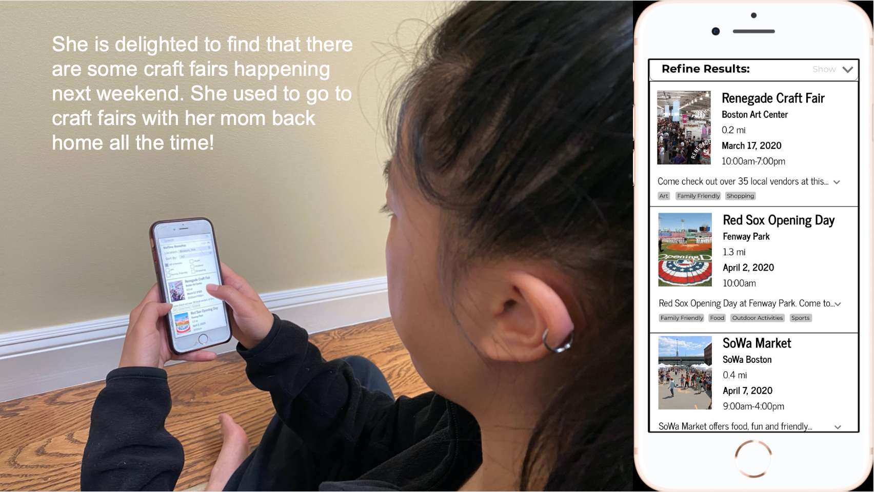
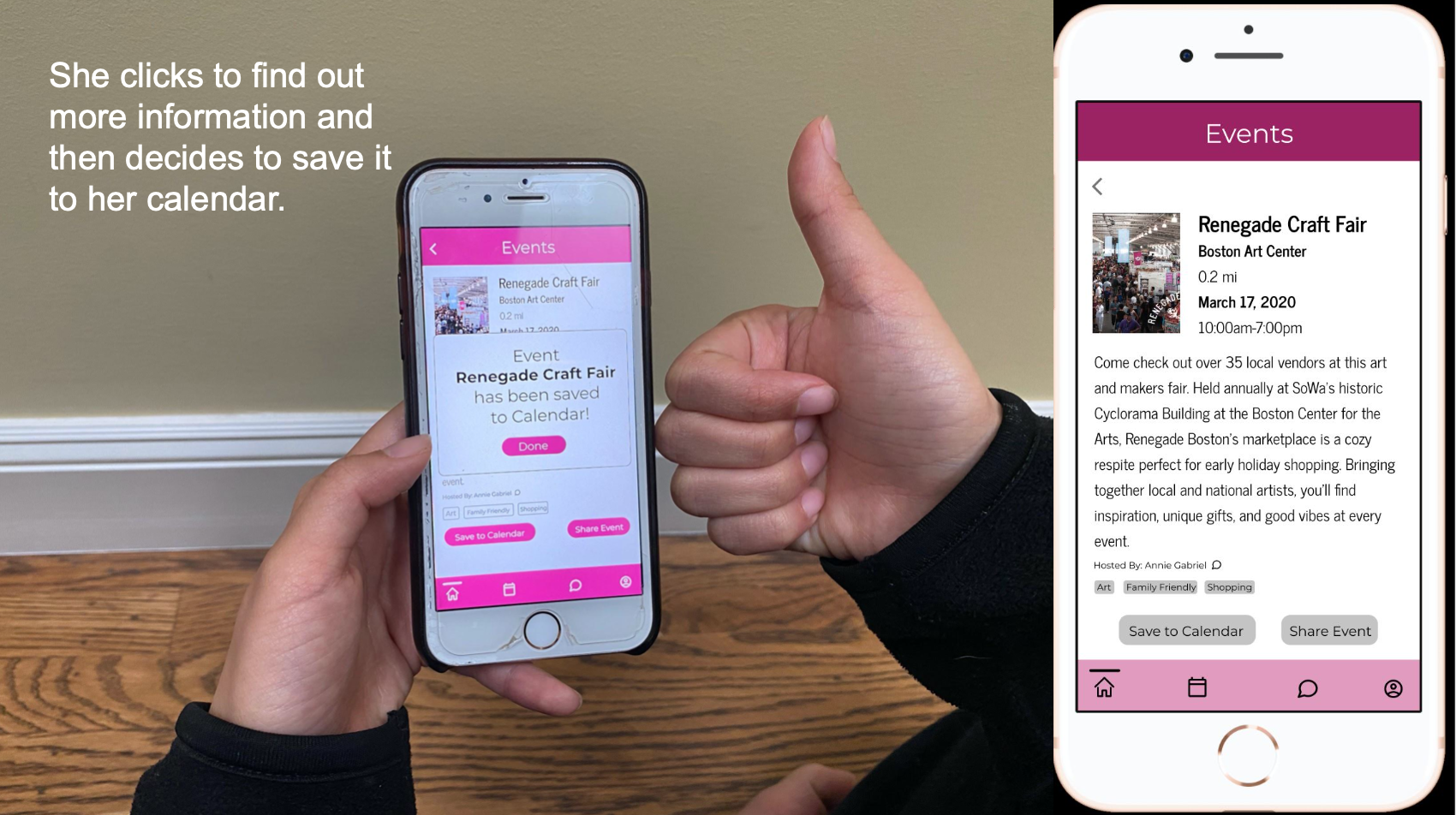
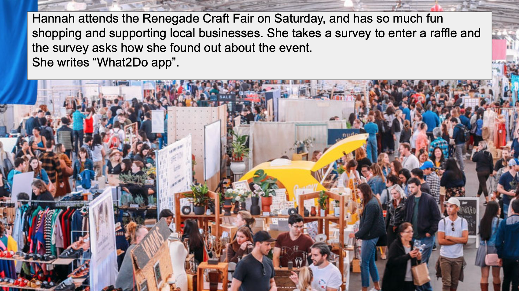
Experience Prototype
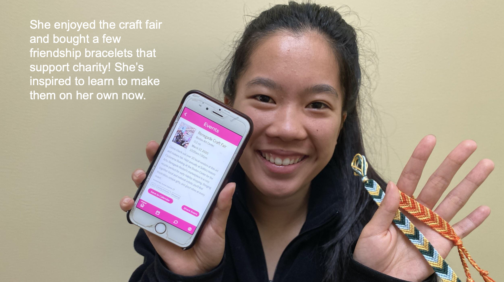
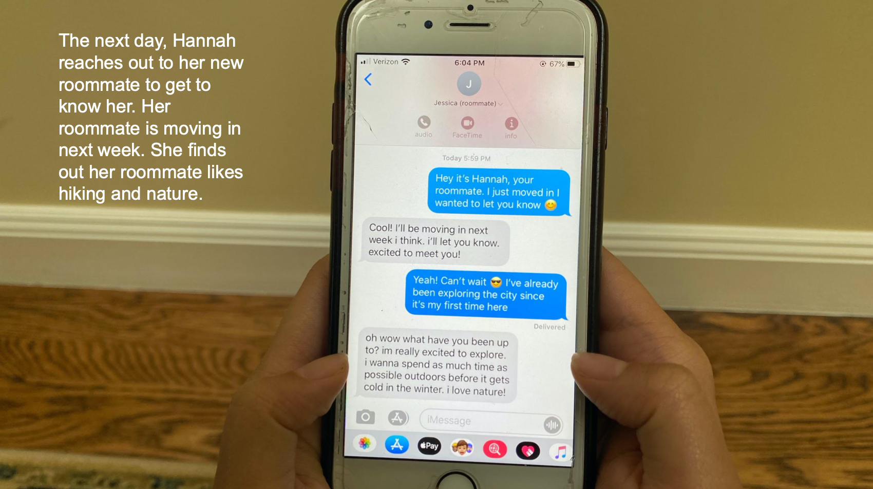
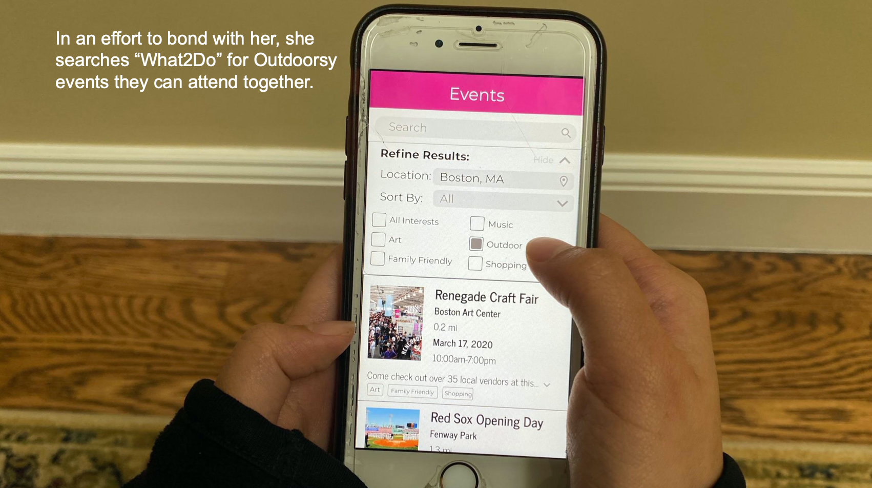
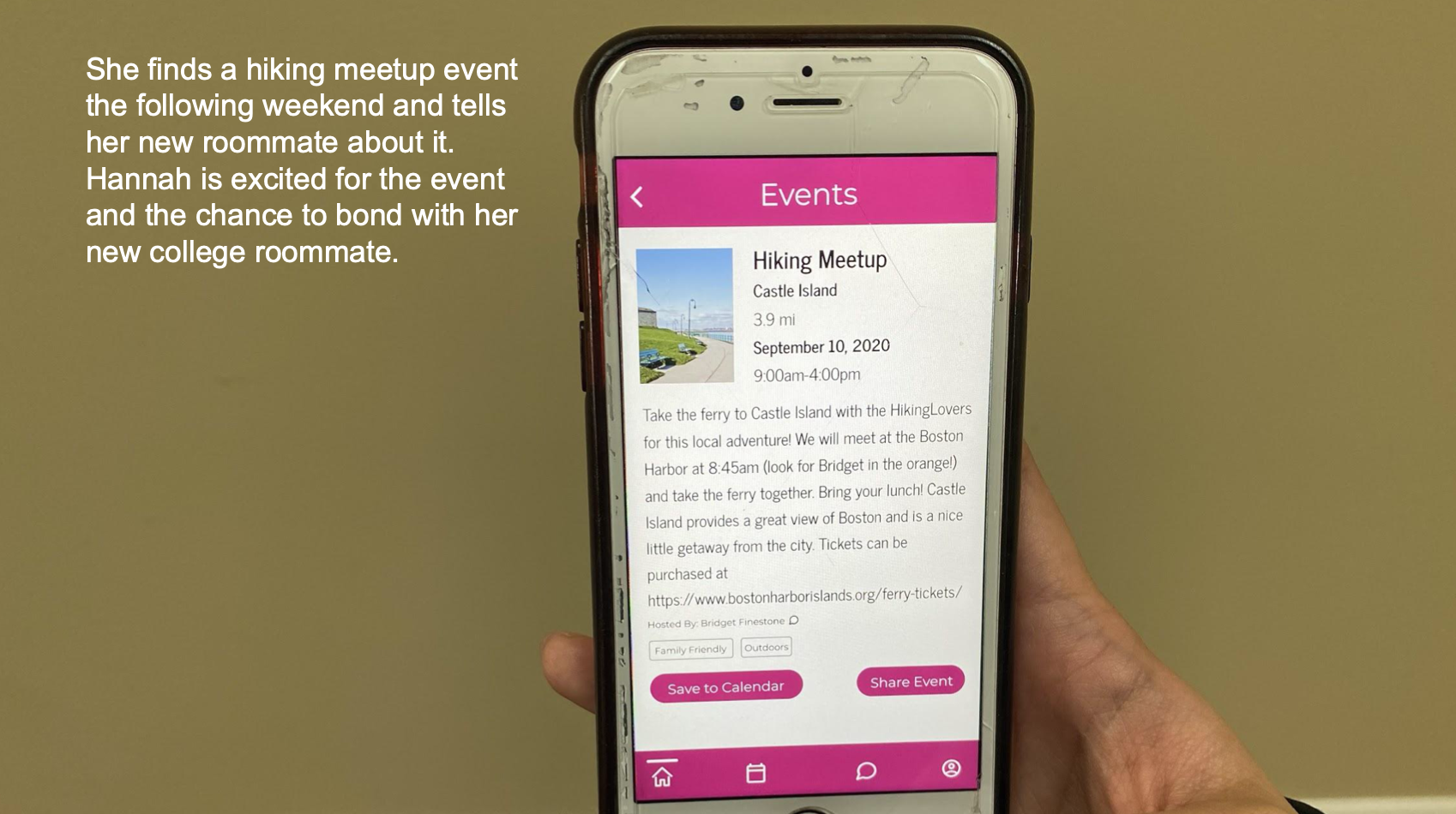
I created an experience prototype that showcases an actual user using What2Do. This is a live recreation of the storyboard. However, due to COVID-19, I did not have access to any elderly people to use my app. I decided to abstract the use case to any user of any age. My sister, 18 years old, volunteered to be my subject. I refined the use case to fit her needs.
Final Interactive Prototype
Here is a link to the final interactive prototype of the What2Do app in Figma.