Decision Making App
I designed a decision making app for my Interaction Design: Mobile class.
UX Process Summary:
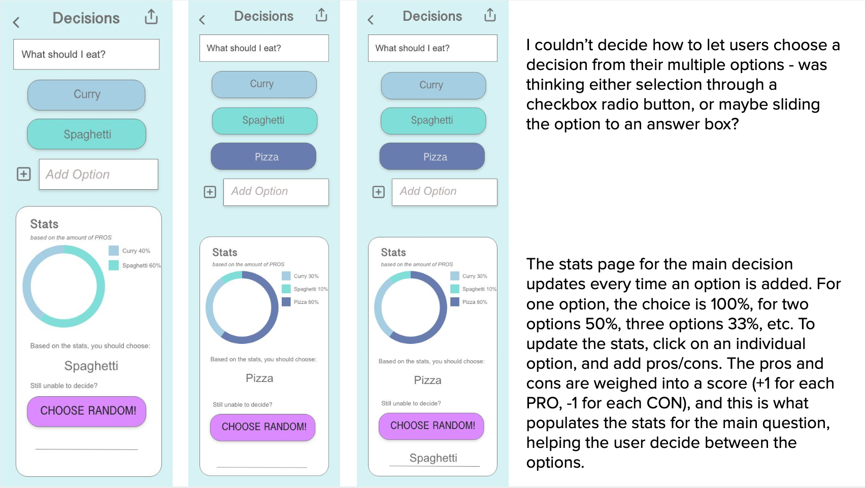
The first step in the process was to research existing apps, and find a good example of a decision making app (IDK), and a bad example of a decision making app (ProsCons). I screenshotted the workflows of each app, and then documented the UI workflows, comparing how simple or complicated the process was. The good app, IDK, had a much simpler workflow and cleaner UI, which made it easier to use. This led me to my final prototype, where I implemented the colors from my VD Spec as well as the feedback from my user testing.
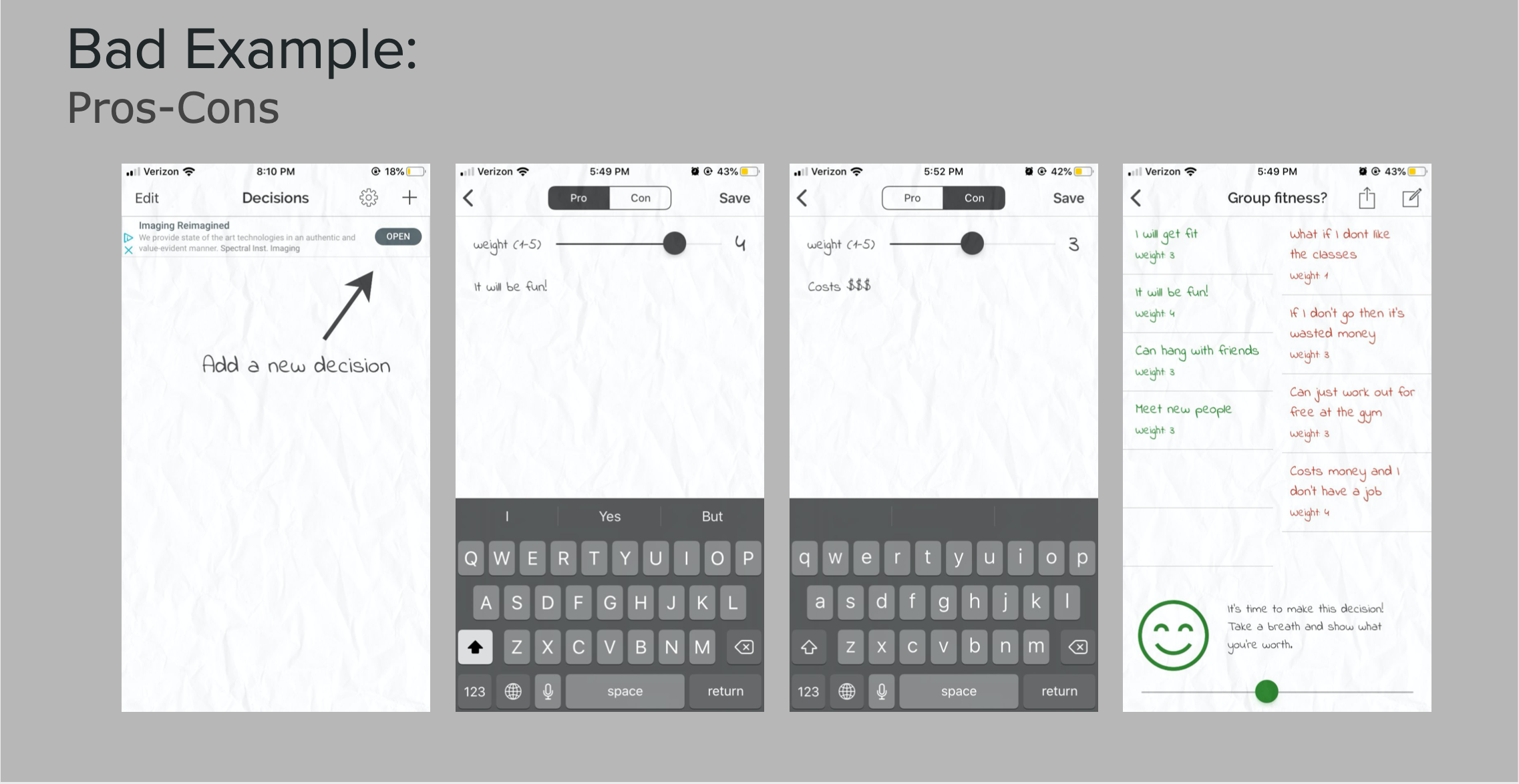
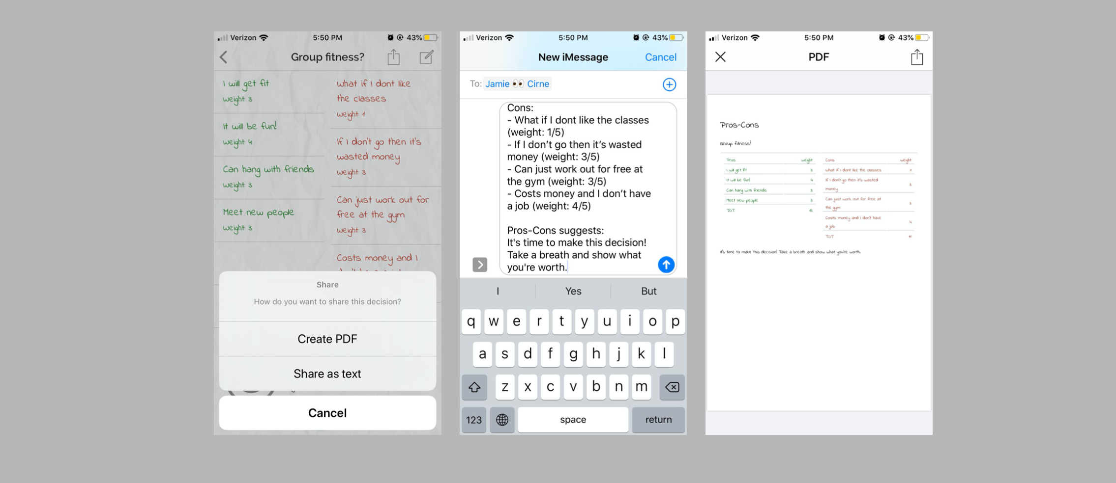
Existing App (Bad): "ProsCons"
Screenshots of the bad app workflow. The user interface was not attractive, there were ads in the corner, and the scroll bar at the bottom of the page was not interactive, even though it looked like it was moveable.
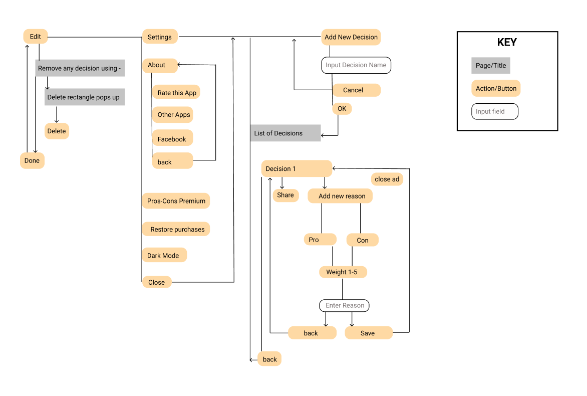
Existing App UI Workflow (Bad): "ProsCons
This workflow was confusing and circular, and had numerous unnecessary pages.
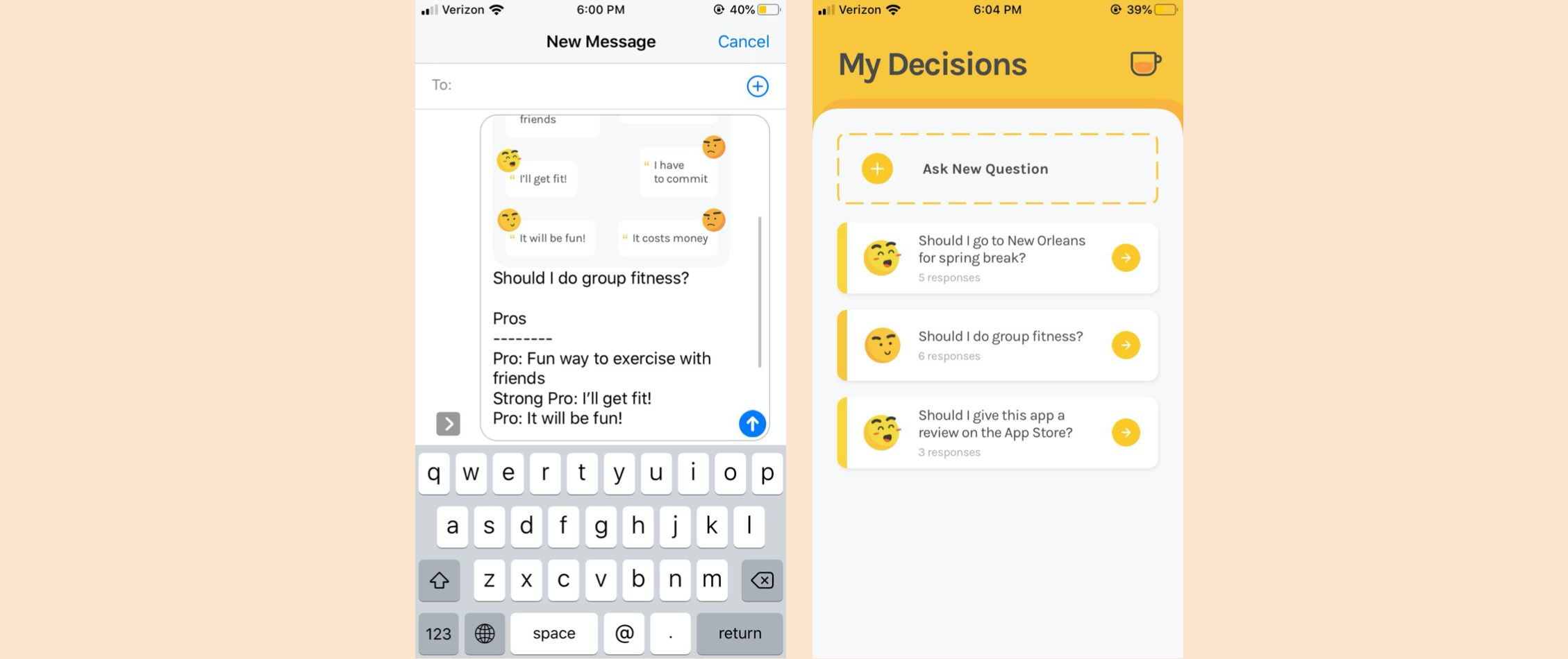
Existing App (Good): "IDK"
The UI was friendly, colorful, and easy to use and understand. The emoticons were related to the decisions and the page split was helpful.
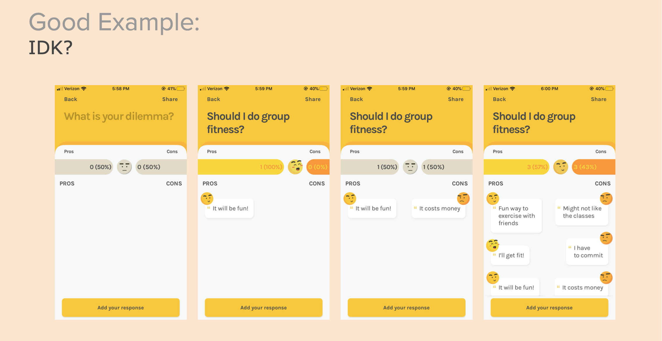
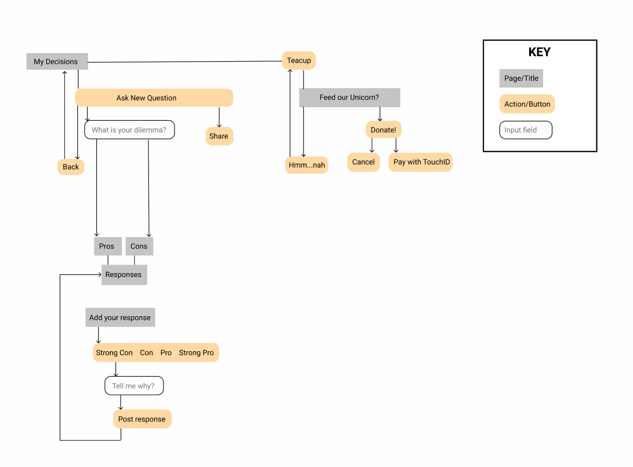
Existing App UI Workflow (Good): "IDK"
The workflow was easy, simple and straightforward.
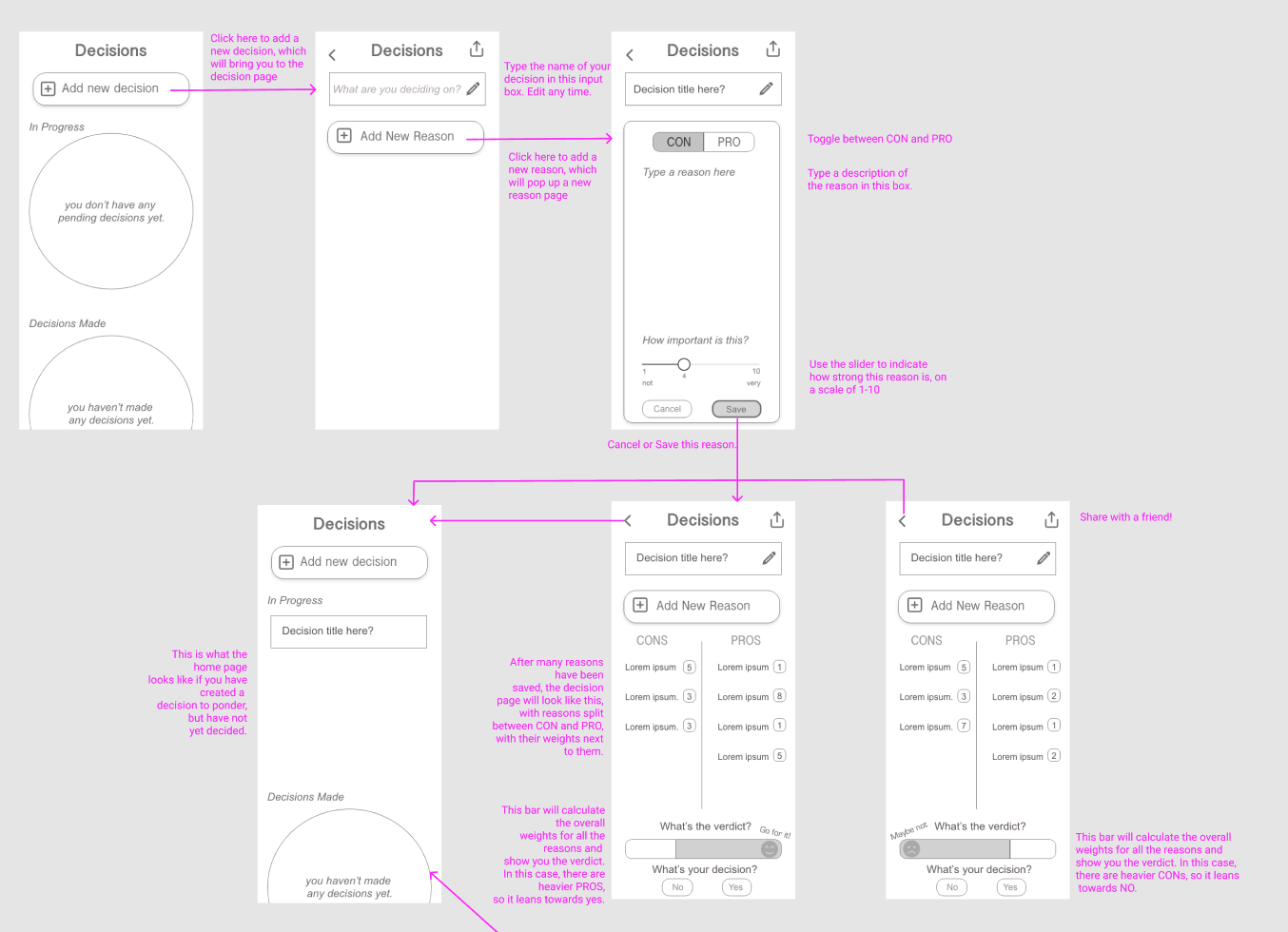
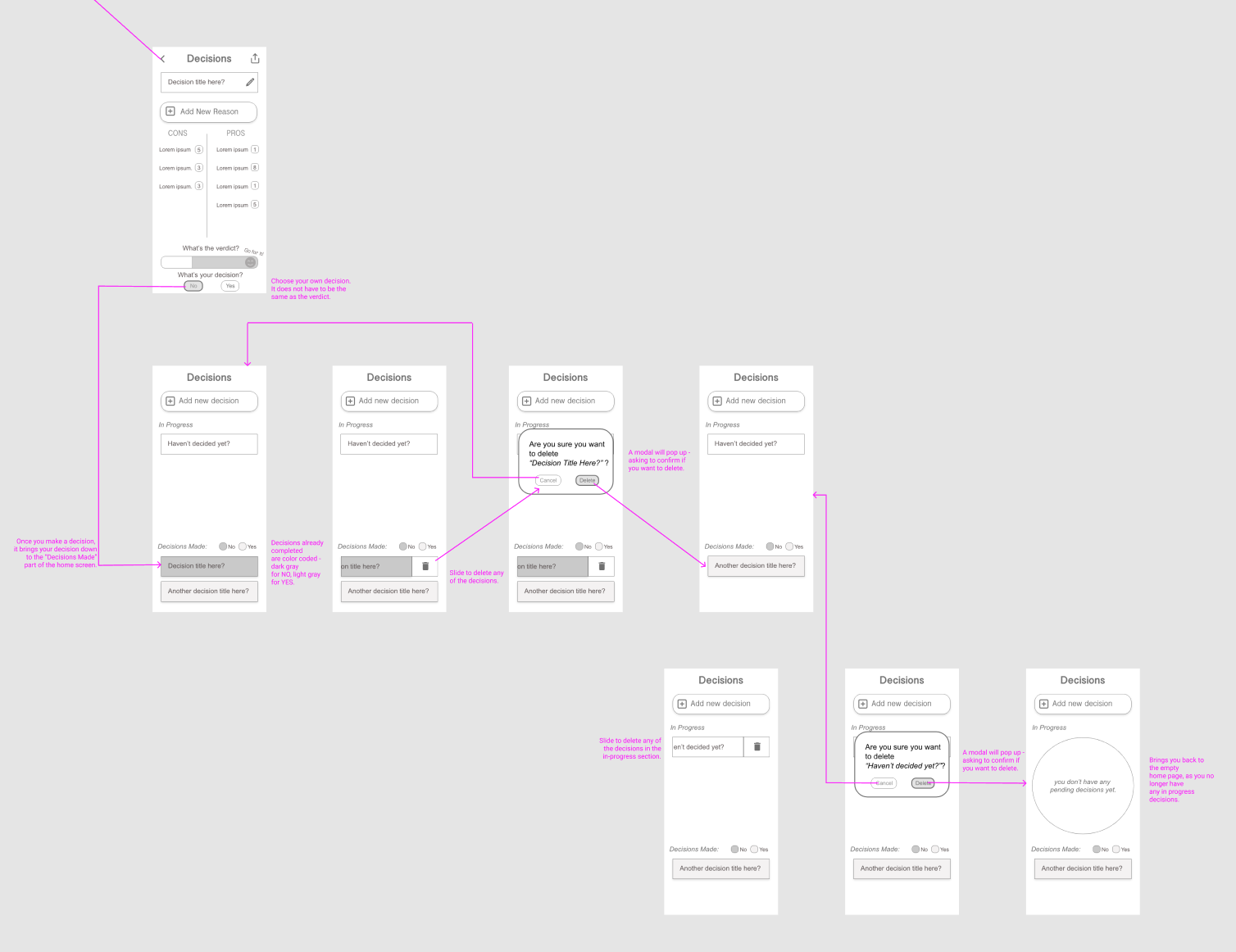
UI Spec
Next, I created a UI Spec for what I wanted my improved app to look like. With minimal colors, I tried to focus mainly on features the app would contain, and which buttons and links would lead to which pages. The pink text showcases how the workflow works, and arrows point to where buttons lead.
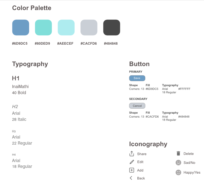
VD Spec
Next, I created a VD Spec, which included colors and branding, such as font styles and sizes. This does not include all of the final colors and fonts, but it was a brand guideline for me to use.
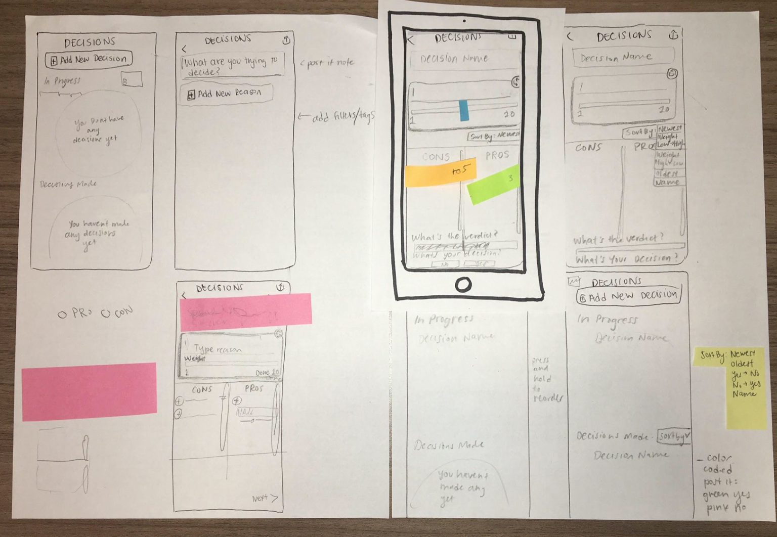
Paper Prototyping
I then created a paper prototype of my app to test on potential users (fellow classmates). Users were able to move a paper cut out phone screen to indicate where they were in the process. I also had sticky notes where they were able to write in what they would type in input fields. Users used their fingers to point to areas on the screen that they wished to click on. I was able to gain valuable feedback from their experiences working with the prototypes. Key takeaways included:
- one user suggested adding tags for the types of decisions (school, work, social, etc.)
- users did not like the dragging action (card for reason) and did not understand it without a tutorial or explanation
- users did not think the refresh was necessary and it should just be a delete or an x button to close
- users suggested adding a "Statistics" page instead of having a verdict and decision crowding the space
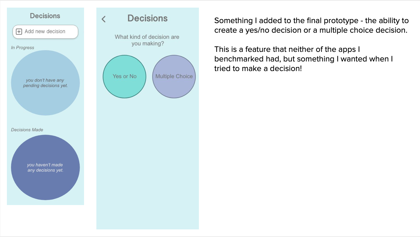
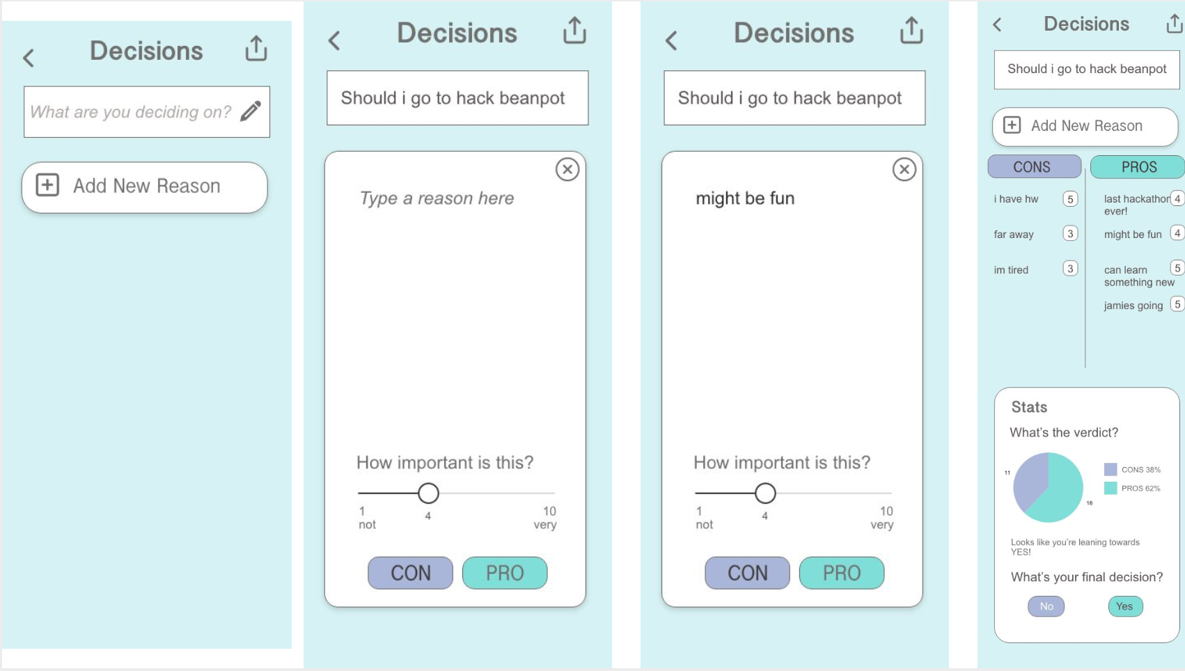
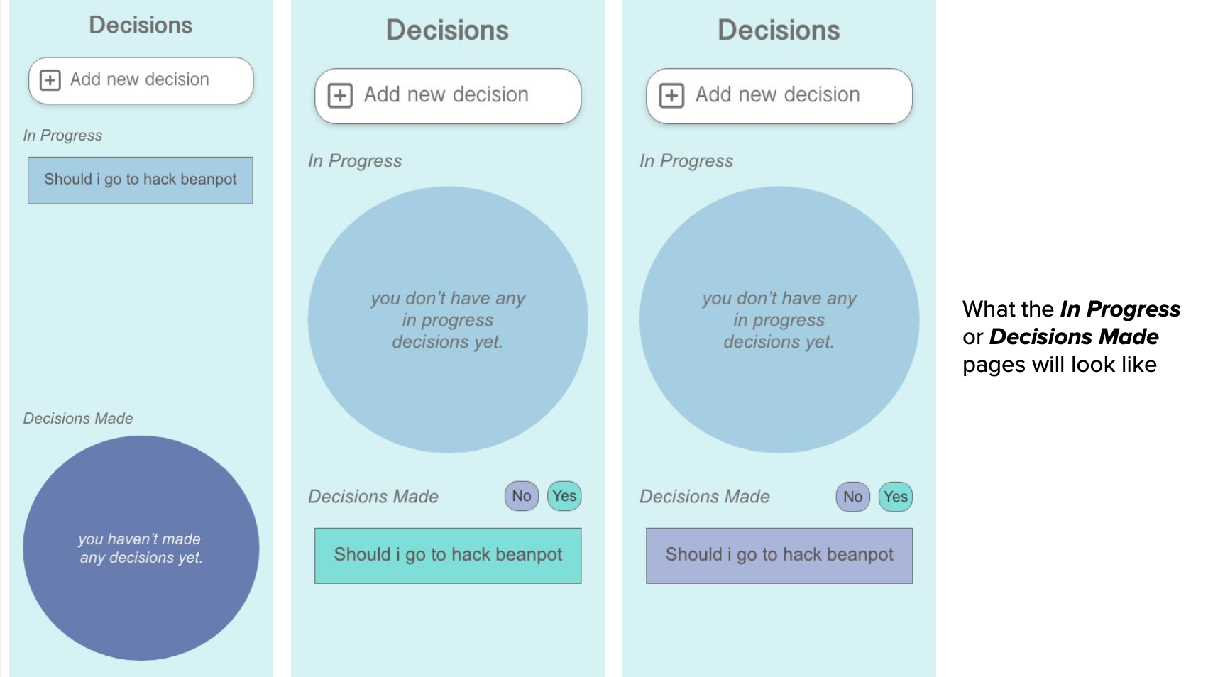
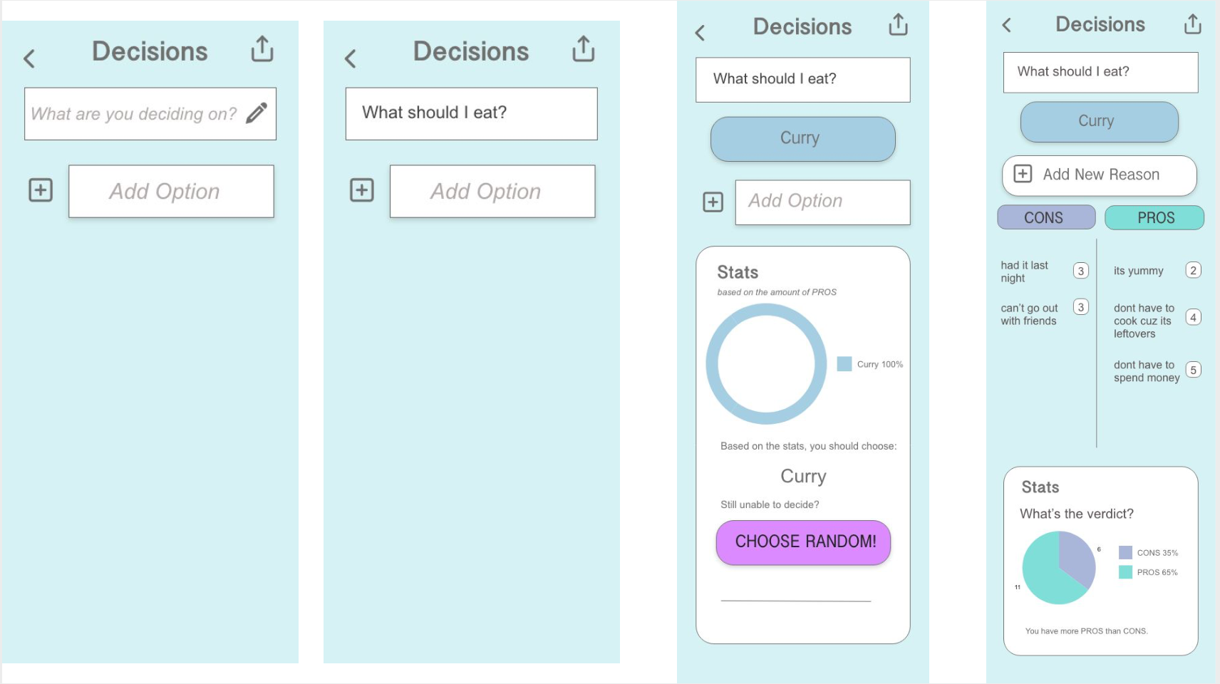
Final Interactive Prototype
Here is a link to my AdobeXD interactive prototype of my redesigned Decision making mobile app.